Monday, April 10, 2017
Final Project
Below is my final project. I am so proud of everything that I was able to accomplish! Thank you for following my progress all these weeks! I present to you: L'Fém:


Thursday, April 6, 2017
The End Is Near
My last two posts will be the uploading of my final project and my CCR (coming very soon!) All that I have left to do is make some minor tweaks to my images before putting my whole magazine together and uploading it. Some of the changes that I am currently working on are:
- Changing the cover image of the table of contents. I still want to use an image that has an interesting composition (I have a specific picture in mind!)
- Shifting the page numbers and/or titles on the table of contents page so they are on the same line (this one is driving me crazy)
- Still working on finding the perfect image/sequence of images for my two-page spread...I had planned to use a sequence of images that had Tiffany wearing the dress from the table of contents page, but I'd rather not have her repeat outfits throughout my magazine.
I also want to say that this has probably been the most stressful/rewarding project I have ever done. I changed my mind countless times and, at one point, almost changed my entire project idea halfway through the project....I'm so glad I didn't do that. I'm so close to the end, though! Thank you for sticking with me for so many weeks!
-Jenn
Tuesday, April 4, 2017
Heavy Editing
Having finished my article, I finally had the chance to go back and look at my cover and table of contents. ...I may have gotten a little carried away with my previous post "Layout and Article Update". As I had stated at the end of that post, I had been having doubts about my cover page. I like the idea behind the image (of Tiffany's hair, pose, and the camera angle conveying a sense of power), but I was having problems with the image itself. The day I took the pictures I had to use three point lighting because we shot at night, but the lamps I had available were difficult to position. Therefore, some pictures came out darker than others (the cover picture was one of them) and I didn't notice this until I started editing because during the shoot I preoccupied with finishing before Tiffany had to leave. I know, lesson for next time, but for now: I have to work with what I have. Since the image I had chosen was too dark, when I edited it on Canva to make it brighter, either the color was leached out of it or the background turned into a muddy color, which wasn't going to cut it for me. Additionally, I loved the picture that was part of my table of contents but it was to dark (however, this one could be fixed 😃). In fact, I loved the picture so much that I ended up considering it for my cover page....which ended up like this (ignore the fact that it still says "Spring 2017", it should be changed to "April 2017"):
 This is pretty different from my first cover but it is definitely better because:
**Note: I had decided to add "#Lets Talk Pop Culture" at the bottom because that is what this specific issue of "L'Fém" deals with. Most magazines have a smaller sub title that provides the overarching description of that issue (different from the seller line, which describes the magazine in general). I got the idea of using pop culture from my research on Bust magazine (see previous post), which writes its articles about pop culture, but through a feminist lens, which was the idea that I had for my magazine. However, after posting this picture, I realize that it could really be confused with the selling line, especially since L'Fém will mostly tackle pop culture issues through a Feminist lens, so I am planning to take that off.
Since I used this image for the cover, then I had to find a new image for my table of contents. I wanted another image that had an interesting composition, but that also complemented the style of the cover photo, both editing wise and in tone. Additionally, I was told by my Media Studies teacher that the table of contents is the vision for the entire magazine (so, no pressure or anything) 😆 Here is my (new) table of contents:
 This picture was actually taken backwards and I decided to flip it to contrast with the composition of the cover. I thought that this choice for my table of contents was interesting because of the colors of her dress: they colors are pretty "girly" and she's wearing a dress. However, then I thought: one of my cover lines is "The Dress Debate", which could be referring to general criticisms about what women wear, including "girly" clothing. Now that I think of it though...this picture and other pictures like it might be better suited for the two page spread... The article titles are pretty much set, except for the last one because I'm still trying to think of another pop culture story that L'Fém could potentially feature.
Tomorrow I'll work on re-imagining the images for my two page spread.
-Jenn

- The colors are perfect: neutral, but still light, bright, and feminine (without having to be "pink and frilly")
- The title looks better off to the side, especially with this image, though I'm going to size it better so it doesn't cover part of Tiffany's face
- The composition is honestly stunning. The shadow effect is still there, but it is created through a greenish tone that complements her top; The image is placed on the page according to the rule of thirds, making it more visually appealing; her hairstyle and top could seem both casual or a little sophisticated, but definitely not like they were "professionally" styled, which was something that I wanted to stray from for my magazine.
- In this image Tiffany is looking at the camera, which is better in terms of genre. Although there are some examples of general interest Feminists magazines that feature covers with subjects not looking directly at the camera, there are very few.
**Note: I had decided to add "#Lets Talk Pop Culture" at the bottom because that is what this specific issue of "L'Fém" deals with. Most magazines have a smaller sub title that provides the overarching description of that issue (different from the seller line, which describes the magazine in general). I got the idea of using pop culture from my research on Bust magazine (see previous post), which writes its articles about pop culture, but through a feminist lens, which was the idea that I had for my magazine. However, after posting this picture, I realize that it could really be confused with the selling line, especially since L'Fém will mostly tackle pop culture issues through a Feminist lens, so I am planning to take that off.
Since I used this image for the cover, then I had to find a new image for my table of contents. I wanted another image that had an interesting composition, but that also complemented the style of the cover photo, both editing wise and in tone. Additionally, I was told by my Media Studies teacher that the table of contents is the vision for the entire magazine (so, no pressure or anything) 😆 Here is my (new) table of contents:

Tomorrow I'll work on re-imagining the images for my two page spread.
-Jenn
Monday, April 3, 2017
The Article
I'm finally done with my article! Initially the process was long and painful because I never had much of a basis for journalism, but once I accepted the fact that all I could do was sit myself down and write an interview, things starting looking up.
Because of scheduling conflicts, I actually had to interview Tiffany through the phone, but I was still able to judge her expressions and reactions because she has a pretty expressive voice and also because I've known her for thirteen years ☺ Either way, judging her reactions served more for context when writing the interview than for actually including it in the interview.
Something I possibly never mentioned before: Tiffany is a singer songwriter, as well as the rest of her family. Since I decided to focus this Spring issue of L'Fém around pop culture, I felt that it was fitting to interview an artist. She recently wrote a song called "Reflection", which is written, though not specifically about Feminism, though a Feminist perspective (her own interpretation of what that means, which is explained in the article). Therefore, I intertwined questions about the song with questions about her views on Feminism.
I'm very proud of how the article turned out! The only thing that is still missing is the picture of the second page. As it turns out, Canva have many limitations on the sizing of pictures, so there is no possibly way that only one picture will proportionally take up the space that I allotted. Therefore, I am currently looking for three pictures to fill this space, preferably pictures where Tiffany is wearing the same outfit. Additionally, I have to fix the font size of the two-page spread though (therefore shirting every column of text 😡) so I will post the article when I post my final project.
-Jenn
Sunday, April 2, 2017
Layout and Article Update
I'm still working on my article for the two-page spread. I ended up deciding on an interview and interviewing my friend (and the person who served as my model) Tiffany because I had already said that L'Fém was going to focus on discussing pop culture issues and:
a. She's actually a singer
b. She also writes some songs and some of them happen to be, not exclusively from a Feminist perspective, but she still includes some perspective of equality for women in her songs.
I think I have a good interview, but I have to cut, edit, and arrange it, which is taking longer than expected since I never learned the basis for conducting an interview. It's getting there though. I'm giving myself until Tuesday at the latest to have it done.
However, I do have the finished layout for the two page spread, which is below:

The picture above would go on the left page before the actual interview, as is common in most magazine interview layouts. I decided to keep this photo in color because most Feminist magazines have their pictures in color and, also, because the way the color turned out (and the pictures lighting) adds to the positive image of feminism that my magazine will portray.

I forgot to add page numbers at the bottom of each page, but those will be added on for when I post my final product (hopefully soon!)
a. She's actually a singer
b. She also writes some songs and some of them happen to be, not exclusively from a Feminist perspective, but she still includes some perspective of equality for women in her songs.
I think I have a good interview, but I have to cut, edit, and arrange it, which is taking longer than expected since I never learned the basis for conducting an interview. It's getting there though. I'm giving myself until Tuesday at the latest to have it done.
However, I do have the finished layout for the two page spread, which is below:

The picture above would go on the left page before the actual interview, as is common in most magazine interview layouts. I decided to keep this photo in color because most Feminist magazines have their pictures in color and, also, because the way the color turned out (and the pictures lighting) adds to the positive image of feminism that my magazine will portray.

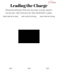
The page above is the first page of the interview. The columns that say "add a little bit of body text" will contain questions and answers from the interview. The black box in the center is there for reference. It will be white, but that boxed area will contain a prominent quote from the interview. I'm going to add the editor names (so me) just above where it says "ass a little bit of body text" to indicate that the interview was conducted by myself. I also decided to add a tiny version of the masthead on the left of each page will text to give each page a pop of color, but also as a way to identify the magazine if the interview were ever being read on its own, making L'Fém more widely known.

The picture from above is the second page of the interview. Once again, the columns that say "add a little bit of body" will contain questions and answers from the interview, although I may not fill up the third column with text all the way. The black box at the top of the page will be a picture of Tiffany, although I still haven't decided on one yet.
I forgot to add page numbers at the bottom of each page, but those will be added on for when I post my final product (hopefully soon!)
-Jenn
Saturday, April 1, 2017
Cover Page and Table of Contents (finally)
I'm so happy to finally be able to show my cover and table of contents! Yesterdays shoot was pretty rough (see previous post), but I looking at some of the pictures that i was able to take, I'd say it payed off.
Without exaggerating, I actually took 500 photos yesterday (although only about half of those I could use because I'm still a photographer in training 😏) I wanted something impactful for my cover, not just Tiffany doing a pretty pose. That's why I'm so glad that in the midst of my exhaustion I had the idea to shoot some pictures from a low angle. I was actually down on one knee tying my shoe when I looked up and saw her pose (the picture on the cover). It looked powerful in a way, so I instructed her to recreate it when we resumed shooting, while I had my mom pointing a blow dryer at her hair from the hallway. I shot the picture with a low angle that was not too extreme, but still clearly a low angle, to complement the image the hair, shadow, and firm pose give of being powerful, but not domineering.

**Note: The date says Spring 2017, but that will be changed to "April 2017", as established in a previous blog post. Also, "The Issue With Feminism" sounds negative, which I totally did not intend (I intended it to be the overarching theme of this specific issue), as well as the fact that it looks really strange overlapping the title, so that will be changed for sure.
Below is my table of contents. I decided that the layout that I had designed was too pink and the inspiration for my design (the Vogue table of contents) could not be done because after hour joomag, I just can't figure it out. Therefore, I must move forward. The new layout is pretty simple because most Feminist magazines typically have a table of contents with the information centered in the page and nothing else. However, since my magazine in a general-interest Feminist magazine, it's a little different and follow a combination of the layout for both a Feminist magazine and a regular women's magazine: it's simple and has the list of articles going straight down, but also includes a picture to the side, taken from the waist up, which is typical of both genres of magazines.

I'm happy with how they turned out, but I am a little concerned by how dark the images are. Yes, the images are edited somewhat, but no matter what brightness and contrast I apply to them of Canva, they still come out pretty dark! Additionally, the background of the cover is looking a little muddy brown to me...definitely not appealing. I will therefore try to play around with the images a little more or have to pick different ones 😓. But for now, on to the two page spread!
-Jenn
Subscribe to:
Posts (Atom)