Monday, April 10, 2017
Final Project
Below is my final project. I am so proud of everything that I was able to accomplish! Thank you for following my progress all these weeks! I present to you: L'Fém:


Thursday, April 6, 2017
The End Is Near
My last two posts will be the uploading of my final project and my CCR (coming very soon!) All that I have left to do is make some minor tweaks to my images before putting my whole magazine together and uploading it. Some of the changes that I am currently working on are:
- Changing the cover image of the table of contents. I still want to use an image that has an interesting composition (I have a specific picture in mind!)
- Shifting the page numbers and/or titles on the table of contents page so they are on the same line (this one is driving me crazy)
- Still working on finding the perfect image/sequence of images for my two-page spread...I had planned to use a sequence of images that had Tiffany wearing the dress from the table of contents page, but I'd rather not have her repeat outfits throughout my magazine.
I also want to say that this has probably been the most stressful/rewarding project I have ever done. I changed my mind countless times and, at one point, almost changed my entire project idea halfway through the project....I'm so glad I didn't do that. I'm so close to the end, though! Thank you for sticking with me for so many weeks!
-Jenn
Tuesday, April 4, 2017
Heavy Editing
Having finished my article, I finally had the chance to go back and look at my cover and table of contents. ...I may have gotten a little carried away with my previous post "Layout and Article Update". As I had stated at the end of that post, I had been having doubts about my cover page. I like the idea behind the image (of Tiffany's hair, pose, and the camera angle conveying a sense of power), but I was having problems with the image itself. The day I took the pictures I had to use three point lighting because we shot at night, but the lamps I had available were difficult to position. Therefore, some pictures came out darker than others (the cover picture was one of them) and I didn't notice this until I started editing because during the shoot I preoccupied with finishing before Tiffany had to leave. I know, lesson for next time, but for now: I have to work with what I have. Since the image I had chosen was too dark, when I edited it on Canva to make it brighter, either the color was leached out of it or the background turned into a muddy color, which wasn't going to cut it for me. Additionally, I loved the picture that was part of my table of contents but it was to dark (however, this one could be fixed 😃). In fact, I loved the picture so much that I ended up considering it for my cover page....which ended up like this (ignore the fact that it still says "Spring 2017", it should be changed to "April 2017"):
 This is pretty different from my first cover but it is definitely better because:
**Note: I had decided to add "#Lets Talk Pop Culture" at the bottom because that is what this specific issue of "L'Fém" deals with. Most magazines have a smaller sub title that provides the overarching description of that issue (different from the seller line, which describes the magazine in general). I got the idea of using pop culture from my research on Bust magazine (see previous post), which writes its articles about pop culture, but through a feminist lens, which was the idea that I had for my magazine. However, after posting this picture, I realize that it could really be confused with the selling line, especially since L'Fém will mostly tackle pop culture issues through a Feminist lens, so I am planning to take that off.
Since I used this image for the cover, then I had to find a new image for my table of contents. I wanted another image that had an interesting composition, but that also complemented the style of the cover photo, both editing wise and in tone. Additionally, I was told by my Media Studies teacher that the table of contents is the vision for the entire magazine (so, no pressure or anything) 😆 Here is my (new) table of contents:
 This picture was actually taken backwards and I decided to flip it to contrast with the composition of the cover. I thought that this choice for my table of contents was interesting because of the colors of her dress: they colors are pretty "girly" and she's wearing a dress. However, then I thought: one of my cover lines is "The Dress Debate", which could be referring to general criticisms about what women wear, including "girly" clothing. Now that I think of it though...this picture and other pictures like it might be better suited for the two page spread... The article titles are pretty much set, except for the last one because I'm still trying to think of another pop culture story that L'Fém could potentially feature.
Tomorrow I'll work on re-imagining the images for my two page spread.
-Jenn

- The colors are perfect: neutral, but still light, bright, and feminine (without having to be "pink and frilly")
- The title looks better off to the side, especially with this image, though I'm going to size it better so it doesn't cover part of Tiffany's face
- The composition is honestly stunning. The shadow effect is still there, but it is created through a greenish tone that complements her top; The image is placed on the page according to the rule of thirds, making it more visually appealing; her hairstyle and top could seem both casual or a little sophisticated, but definitely not like they were "professionally" styled, which was something that I wanted to stray from for my magazine.
- In this image Tiffany is looking at the camera, which is better in terms of genre. Although there are some examples of general interest Feminists magazines that feature covers with subjects not looking directly at the camera, there are very few.
**Note: I had decided to add "#Lets Talk Pop Culture" at the bottom because that is what this specific issue of "L'Fém" deals with. Most magazines have a smaller sub title that provides the overarching description of that issue (different from the seller line, which describes the magazine in general). I got the idea of using pop culture from my research on Bust magazine (see previous post), which writes its articles about pop culture, but through a feminist lens, which was the idea that I had for my magazine. However, after posting this picture, I realize that it could really be confused with the selling line, especially since L'Fém will mostly tackle pop culture issues through a Feminist lens, so I am planning to take that off.
Since I used this image for the cover, then I had to find a new image for my table of contents. I wanted another image that had an interesting composition, but that also complemented the style of the cover photo, both editing wise and in tone. Additionally, I was told by my Media Studies teacher that the table of contents is the vision for the entire magazine (so, no pressure or anything) 😆 Here is my (new) table of contents:

Tomorrow I'll work on re-imagining the images for my two page spread.
-Jenn
Monday, April 3, 2017
The Article
I'm finally done with my article! Initially the process was long and painful because I never had much of a basis for journalism, but once I accepted the fact that all I could do was sit myself down and write an interview, things starting looking up.
Because of scheduling conflicts, I actually had to interview Tiffany through the phone, but I was still able to judge her expressions and reactions because she has a pretty expressive voice and also because I've known her for thirteen years ☺ Either way, judging her reactions served more for context when writing the interview than for actually including it in the interview.
Something I possibly never mentioned before: Tiffany is a singer songwriter, as well as the rest of her family. Since I decided to focus this Spring issue of L'Fém around pop culture, I felt that it was fitting to interview an artist. She recently wrote a song called "Reflection", which is written, though not specifically about Feminism, though a Feminist perspective (her own interpretation of what that means, which is explained in the article). Therefore, I intertwined questions about the song with questions about her views on Feminism.
I'm very proud of how the article turned out! The only thing that is still missing is the picture of the second page. As it turns out, Canva have many limitations on the sizing of pictures, so there is no possibly way that only one picture will proportionally take up the space that I allotted. Therefore, I am currently looking for three pictures to fill this space, preferably pictures where Tiffany is wearing the same outfit. Additionally, I have to fix the font size of the two-page spread though (therefore shirting every column of text 😡) so I will post the article when I post my final project.
-Jenn
Sunday, April 2, 2017
Layout and Article Update
I'm still working on my article for the two-page spread. I ended up deciding on an interview and interviewing my friend (and the person who served as my model) Tiffany because I had already said that L'Fém was going to focus on discussing pop culture issues and:
a. She's actually a singer
b. She also writes some songs and some of them happen to be, not exclusively from a Feminist perspective, but she still includes some perspective of equality for women in her songs.
I think I have a good interview, but I have to cut, edit, and arrange it, which is taking longer than expected since I never learned the basis for conducting an interview. It's getting there though. I'm giving myself until Tuesday at the latest to have it done.
However, I do have the finished layout for the two page spread, which is below:

The picture above would go on the left page before the actual interview, as is common in most magazine interview layouts. I decided to keep this photo in color because most Feminist magazines have their pictures in color and, also, because the way the color turned out (and the pictures lighting) adds to the positive image of feminism that my magazine will portray.

I forgot to add page numbers at the bottom of each page, but those will be added on for when I post my final product (hopefully soon!)
a. She's actually a singer
b. She also writes some songs and some of them happen to be, not exclusively from a Feminist perspective, but she still includes some perspective of equality for women in her songs.
I think I have a good interview, but I have to cut, edit, and arrange it, which is taking longer than expected since I never learned the basis for conducting an interview. It's getting there though. I'm giving myself until Tuesday at the latest to have it done.
However, I do have the finished layout for the two page spread, which is below:

The picture above would go on the left page before the actual interview, as is common in most magazine interview layouts. I decided to keep this photo in color because most Feminist magazines have their pictures in color and, also, because the way the color turned out (and the pictures lighting) adds to the positive image of feminism that my magazine will portray.

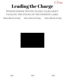
The page above is the first page of the interview. The columns that say "add a little bit of body text" will contain questions and answers from the interview. The black box in the center is there for reference. It will be white, but that boxed area will contain a prominent quote from the interview. I'm going to add the editor names (so me) just above where it says "ass a little bit of body text" to indicate that the interview was conducted by myself. I also decided to add a tiny version of the masthead on the left of each page will text to give each page a pop of color, but also as a way to identify the magazine if the interview were ever being read on its own, making L'Fém more widely known.

The picture from above is the second page of the interview. Once again, the columns that say "add a little bit of body" will contain questions and answers from the interview, although I may not fill up the third column with text all the way. The black box at the top of the page will be a picture of Tiffany, although I still haven't decided on one yet.
I forgot to add page numbers at the bottom of each page, but those will be added on for when I post my final product (hopefully soon!)
-Jenn
Saturday, April 1, 2017
Cover Page and Table of Contents (finally)
I'm so happy to finally be able to show my cover and table of contents! Yesterdays shoot was pretty rough (see previous post), but I looking at some of the pictures that i was able to take, I'd say it payed off.
Without exaggerating, I actually took 500 photos yesterday (although only about half of those I could use because I'm still a photographer in training 😏) I wanted something impactful for my cover, not just Tiffany doing a pretty pose. That's why I'm so glad that in the midst of my exhaustion I had the idea to shoot some pictures from a low angle. I was actually down on one knee tying my shoe when I looked up and saw her pose (the picture on the cover). It looked powerful in a way, so I instructed her to recreate it when we resumed shooting, while I had my mom pointing a blow dryer at her hair from the hallway. I shot the picture with a low angle that was not too extreme, but still clearly a low angle, to complement the image the hair, shadow, and firm pose give of being powerful, but not domineering.

**Note: The date says Spring 2017, but that will be changed to "April 2017", as established in a previous blog post. Also, "The Issue With Feminism" sounds negative, which I totally did not intend (I intended it to be the overarching theme of this specific issue), as well as the fact that it looks really strange overlapping the title, so that will be changed for sure.
Below is my table of contents. I decided that the layout that I had designed was too pink and the inspiration for my design (the Vogue table of contents) could not be done because after hour joomag, I just can't figure it out. Therefore, I must move forward. The new layout is pretty simple because most Feminist magazines typically have a table of contents with the information centered in the page and nothing else. However, since my magazine in a general-interest Feminist magazine, it's a little different and follow a combination of the layout for both a Feminist magazine and a regular women's magazine: it's simple and has the list of articles going straight down, but also includes a picture to the side, taken from the waist up, which is typical of both genres of magazines.

I'm happy with how they turned out, but I am a little concerned by how dark the images are. Yes, the images are edited somewhat, but no matter what brightness and contrast I apply to them of Canva, they still come out pretty dark! Additionally, the background of the cover is looking a little muddy brown to me...definitely not appealing. I will therefore try to play around with the images a little more or have to pick different ones 😓. But for now, on to the two page spread!
-Jenn
Friday, March 31, 2017
The (not so) Glamorous Side Of a Photo Shoot
Today I learned that photo shoots aren't all that glamorous (for the photographers at least).
I had set the time for the shoot for 4 p.m., but because of some little bumps in the road, we ended up starting the shoot at 7:00 p.m. That in itself was a little bit of a game changer because natural light was no longer an option...neither was shooting outside (or shooting another day because I was way behind schedule to begin with). Therefore, I had to try my hand at three-point lighting on a six foot long white wall. However, of that six foot long wall, I could only have Tiffany stand on about three feet of that because if not the light switch on the wall was noticeable and I couldn't shoot her full frame because then the crown molding, outlet, and tile floor were noticeable. Additionally, I could only position myself in a tiny area because my living room t.v. stand was in the way and it was too heavy to move out of the way. So, you could say it was a little bit of an experience. 😓
When picking out her clothes I went through her closet and picked any tops or dresses that had a bold color or a spring-like print and packed them to figure it out as we went during the shoot, since I'm making the April edition (it's Spring!) of my magazine. I didn't worry too much about the "feminine" factor of the clothing because the clothes are feminine, but in a different, unexpected way. For example, instead of showing femininity with pink and frilly fabric, this is shown through the cut and brightness of the clothes. (I will show this more specifically when I post some photographs.) In total there were four outfits: an orange top with jeans, a floral dress, a light green top with jeans, and a floral top with jeans. The clothes themselves were also relatively simple (ex: she wore jeans) because my magazine, as are most Feminist magazines, are trying to appeal to a middle class audience, as well as the fact that editorial-type clothing (like I had been planning before. Yikes) and poses would obscure the importance of the Feminist message. Therefore, I found a middle ground with the clothing: appealing, but simple.
I had her do a variety of things in each outfit, mostly just telling her to move around and not try to specifically pose, so the shots would look more natural. This was part of the reason that I decided to use my phone (a Samsung Galaxy S4) to take pictures with; I needed a camera that could capture a succession of photos more quickly. I think I took some really great pictures, but I haven't been able to look through them all yet. Tomorrow I'll work on my cover and table of contents, so I'll post them some pictures then.
-Jenn
Saturday, March 25, 2017
Table of Contents and More Decision-Making
I was designing my table of contents and this is what I have so far:

I used the same color for the background as the color from the logo on the front page, but for some reason, Canva is making the color seem much more pink on this page. Therefore, I'm considering inverting the colors because maybe it's too much red/pink? I'll think it through a little more...I was thinking of having the numbers on the right be titles for stories (which I have yet to come up with) and the center, between the numbers on the left and what are going to be the title on the right, I will possibly have a picture in the middle, with the text being shaped around it. I say possibly because I've been using Canva for my designing and, so far, I have yet to discover a feature that lets you cut around text. I may have to start figuring out Joomag and, if not, change my plan for the table of contents ☹
Below was an inspiration for my table of contents design. It is from an edition of Vogue magazine from a while back, but I feel that it is a valid source to draw inspiration from because although Vogue is mostly a women's fashion magazine, it sometimes writes its articles from a feminist standpoint.
 Also, as of now I am leaning more towards an opinion piece (based on research) for my article, but I'm going to ask my teacher to make sure that's something that I'm allowed to do.
-Jenn

I used the same color for the background as the color from the logo on the front page, but for some reason, Canva is making the color seem much more pink on this page. Therefore, I'm considering inverting the colors because maybe it's too much red/pink? I'll think it through a little more...I was thinking of having the numbers on the right be titles for stories (which I have yet to come up with) and the center, between the numbers on the left and what are going to be the title on the right, I will possibly have a picture in the middle, with the text being shaped around it. I say possibly because I've been using Canva for my designing and, so far, I have yet to discover a feature that lets you cut around text. I may have to start figuring out Joomag and, if not, change my plan for the table of contents ☹
Below was an inspiration for my table of contents design. It is from an edition of Vogue magazine from a while back, but I feel that it is a valid source to draw inspiration from because although Vogue is mostly a women's fashion magazine, it sometimes writes its articles from a feminist standpoint.

-Jenn
Felsenthal, Julia. "What About Women Reminds Us About Feminism." Vogue, 19 Nov. 2015, www.vogue.com/
article/francoise-gilot-lisa-alther-about-women-feminism.
Friday, March 24, 2017
Behind Schedule, But Back On Track
So I'm a little behind schedule, but I'm just going to power through it at this point. I have good news though: I have started designing my cover:

**Note: This is a pretty rough outline, mostly to get myself back into the project, so I will probably change some things around.
I was able to create the red/pink mixture I had thought of before and I think it fits really well. I'm going to bring the two texts from the bottom to the sides, so it fits more with the genre conventions of a general interest Feminist magazine. Also, I'm changing the quote because I just put it there as a placeholder since I don't know if I'm doing and interview or an opinion piece yet. Additionally, I'm going to add more cover lines and add a date. I decided that L'Fém would be a monthly magazine because
a. Most Feminist magazines are either monthly or seasonally
b. I decided not to make my magazine seasonal because since it will be dealing with pop culture, by the time that each issue of my magazine is published, the topics/events that it contains will already have been discussed to death and past, making my magazine less influential and having less of an impact.
More good news: I have finally found my model. I decided not to go with any of the shots that I had sketched out before in a previous blog post because my idea for the article changed completely. Since I'm going to be writing about a different image of feminism (see selling line, The New Face of Feminism), I'm going to have my friend Tiffany (who is serving as my model) be in more candid-like pictures. I'm just going to have her move around, try out different poses...nothing too specific and I'll go from there.
I'm going to take the pictures on Friday and hopefully have them edited, as well as have the article done, by the weekend. Fingers crossed...
-Jenn
Wednesday, March 22, 2017
Critiques and Fighting the Urge to Start All Over
Today in Media Studies class we met in the library to give and receive critiques for our Foundation Portfolio projects. The people in my assigned critique group said that they liked the idea of doing a Feminist magazine, but they didn't understand the direction I was going in for my article or my pictures because I myself sounded unsure when I explained my project. Truthfully, I really was unsure about my whole magazine and had thought about completely changing to a cooking magazine. Luckily, I managed to talk myself out of it by reasoning:
a. I would have to do three weeks worth of work in one weekend
b. I still have no idea how I would do my own fresh take on a cooking magazine
c. I can't cook anyway, so making a cooking magazine would not be any easier
I think a major part of the problem was that in planning these editorial-type photos and making a bold unconventional title, I was losing the essence of the importance of Feminism. I had felt like I was stuck doing a Feminist magazine,until I thought about one of the ideas given during the critique. When I was explaining that I wanted my magazine to be a departure from what some people negatively perceive feminism to be, someone suggested that somewhere in my magazine I address this issue. That's how I decided on my new article idea. The same aspect that I wanted my magazine to embody, of breaking the stereotype of the negative image of feminism, is more direct to the genre of my magazine and more relevant to what's going on in the present. My target audience would still stay the same though, because I'm going to try to incorporate my new article idea with pop culture (just no directly focus on fashion...) I'm still deciding whether I'm going to do an opinion piece or an interview, but my article is essentially going to answer why women are hesitant to identify as feminists and what can be done (or should anything be done) to change this image.
-Jenn
Saturday, March 18, 2017
Designing
Okay so I finally started sketching. Please excuse the quality of the photos.
Having established that I was going to be tackling the the current debate about women's fashion, I decided that my cover line would use a play on words to reflect this. "The Fashion Issue" refers to both the theme of this magazine edition and the current problem with fashion. Since I want my composition to be clean and simple, as of now, I am going to try to use only three colors on my cover: red/pink, white, and black. However, the composition can't be too empty, or else it wouldn't fit into the feminist genre, so I decided to add a side border that would be only on the left and at the top. I got the idea for the font after playing around with fonts on Canva and I think it fits well with the concept of fashion, but at the same time it seems like an undone version of cursive writing, which would convey the concept of breaking out of the mold. (**Note: I still haven't decided what the picture on the cover will be so I drew ideas separately from the cover sketch.)There are some things that I still need to touch up, but this is the general idea for my cover:
Below is the image that I'm currently leaning towards the most for the cover. Since this edition of L'Fém will be about how society has trapped women in a fashion debate, I thought it would be interesting to shoot my model with her hands out, holding on to bars that I would edit into the photo, but not completely caged in. This would represent how women are being trapped by society on the issue, but at the same time are trying to break free. Since this idea would incorporate the extra element of bars, I I end up going with this idea I think that I would eliminate the side border on the cover, or the composition would be too busy. Originally, I had shaded the girls face in because I don't have a model yet, but I'm starting to think that it would be interesting to somehow cast the girls face completely in shadow because she is supposed to represent all women and all women don't have the same face. How good of an idea is this? I think I should give myself time to think it over.
This is another idea that I had thought of for the cover image. Basically, it's a girl wearing some sort of dress (could maybe change to a different outfit), with her hair in her face (which would cover the same concept behind obscuring the face in the image before), and her arms swinging freely (as in, she's "free"?). This would definitely be a more understated image than the one above, but I kind of like it. If I don't end up using it for the cover, I'll try to find a way to incorporate it into the two-page spread.
This last picture is very editorial looking...and I'm not sure if that is a good thing. I like the idea of the hair splayed out behind her, making her seem a little unpolished, but other than that I don't see how this picture would add any meaning to my magazine issue.
Maybe I'll play around with a few more ideas... particularly something with the hair from the last picture because I really like that idea. More updates coming soon!
-Jenn
Having established that I was going to be tackling the the current debate about women's fashion, I decided that my cover line would use a play on words to reflect this. "The Fashion Issue" refers to both the theme of this magazine edition and the current problem with fashion. Since I want my composition to be clean and simple, as of now, I am going to try to use only three colors on my cover: red/pink, white, and black. However, the composition can't be too empty, or else it wouldn't fit into the feminist genre, so I decided to add a side border that would be only on the left and at the top. I got the idea for the font after playing around with fonts on Canva and I think it fits well with the concept of fashion, but at the same time it seems like an undone version of cursive writing, which would convey the concept of breaking out of the mold. (**Note: I still haven't decided what the picture on the cover will be so I drew ideas separately from the cover sketch.)There are some things that I still need to touch up, but this is the general idea for my cover:
 |
| **Note: the picture says pink, but I'm going to try to create a pink/red mixture instead |
Below is the image that I'm currently leaning towards the most for the cover. Since this edition of L'Fém will be about how society has trapped women in a fashion debate, I thought it would be interesting to shoot my model with her hands out, holding on to bars that I would edit into the photo, but not completely caged in. This would represent how women are being trapped by society on the issue, but at the same time are trying to break free. Since this idea would incorporate the extra element of bars, I I end up going with this idea I think that I would eliminate the side border on the cover, or the composition would be too busy. Originally, I had shaded the girls face in because I don't have a model yet, but I'm starting to think that it would be interesting to somehow cast the girls face completely in shadow because she is supposed to represent all women and all women don't have the same face. How good of an idea is this? I think I should give myself time to think it over.
 |
| Girl would be wearing some sort of dress (although I'm still thinking about the outfit...). If this ends up on the cover, then it would be shot in black and white. |
This is another idea that I had thought of for the cover image. Basically, it's a girl wearing some sort of dress (could maybe change to a different outfit), with her hair in her face (which would cover the same concept behind obscuring the face in the image before), and her arms swinging freely (as in, she's "free"?). This would definitely be a more understated image than the one above, but I kind of like it. If I don't end up using it for the cover, I'll try to find a way to incorporate it into the two-page spread.
 |
| Depending on where this image will be placed, I will decide what colors she will be wearing or if it should be shot in black and white. |
This last picture is very editorial looking...and I'm not sure if that is a good thing. I like the idea of the hair splayed out behind her, making her seem a little unpolished, but other than that I don't see how this picture would add any meaning to my magazine issue.
 |
| The face in still picture is also obscured, but, once again, that's still to be decided. |
Maybe I'll play around with a few more ideas... particularly something with the hair from the last picture because I really like that idea. More updates coming soon!
-Jenn
Thursday, March 16, 2017
Color Psychology
Before I begin sketching, I want to know what colors I should be working with, according to what fits with the genre conventions and, also, their meanings. Color is one of the most important aspects of this project because it basically sets the tone for my magazine. Since Feminism is so broad and there are so many different types of Feminist magazines, ranging from fiery and controversial to feminine and subtle, the colors I choose would have to make it clear on what part of the Feminism spectrum L'Fém would fall on.
First, researching the genre conventions I looked for the general interest Feminist magazine genre that I had decided on. Below are the three most prominent examples that I found. Ms. and Bust both have bold colors, but Make/Shift takes a more neutral approach. Therefore, my own magazine can go with many ranges of colors.


I mean, my magazine is called L'Fém, a play on the French word for Feminine, so, of course, the first color I thought of was pink. But is pink too feminine? According to Color Psychology, the meaning of the color pink can vary greatly depending on the culture and context. However, since L'Fém would be produced in the United States, the cultural implications are that pink means feminine. I also found this helpful chart on the https://www.colorpsychology.org/:

I like all the positive implications of the color pink, but the physical weakness and emasculation? Those are the stereotypes that I want to break with my magazine. But in using the color pink would that be seen as purely feminine, with no other meaning behind the color?
Unsure of pink, I decided to look into the meaning of the color red. According to Color Psychology, the color red attracts the most attention out of any of the colors. That's good aesthetically because it would add a pop of color that I could use to draw attention to the title and/or cover line(s). This is another helpful chart that I found on https://www.colorpsychology.org/:

Like with the color pink, I like the positive implications of the color and this time I even like one of the negative meanings behind it: defiance, because that's what I'm trying to portray with my issue on women's fashion. However, anger and aggression are definitely not what I'm looking to convey in my magazine, so that's unfortunate.
Since I like aspects of both pink and red I'm going to try to blend the two colors to create a new color when creating my magazine. More updates soon!
-Jenn
First, researching the genre conventions I looked for the general interest Feminist magazine genre that I had decided on. Below are the three most prominent examples that I found. Ms. and Bust both have bold colors, but Make/Shift takes a more neutral approach. Therefore, my own magazine can go with many ranges of colors.


I mean, my magazine is called L'Fém, a play on the French word for Feminine, so, of course, the first color I thought of was pink. But is pink too feminine? According to Color Psychology, the meaning of the color pink can vary greatly depending on the culture and context. However, since L'Fém would be produced in the United States, the cultural implications are that pink means feminine. I also found this helpful chart on the https://www.colorpsychology.org/:

I like all the positive implications of the color pink, but the physical weakness and emasculation? Those are the stereotypes that I want to break with my magazine. But in using the color pink would that be seen as purely feminine, with no other meaning behind the color?
Unsure of pink, I decided to look into the meaning of the color red. According to Color Psychology, the color red attracts the most attention out of any of the colors. That's good aesthetically because it would add a pop of color that I could use to draw attention to the title and/or cover line(s). This is another helpful chart that I found on https://www.colorpsychology.org/:
Like with the color pink, I like the positive implications of the color and this time I even like one of the negative meanings behind it: defiance, because that's what I'm trying to portray with my issue on women's fashion. However, anger and aggression are definitely not what I'm looking to convey in my magazine, so that's unfortunate.
Since I like aspects of both pink and red I'm going to try to blend the two colors to create a new color when creating my magazine. More updates soon!
-Jenn
"Make/Shift ISSUE 19, SUMMER/FALL 2016." Make/Shift, makeshiftmag.com/.
"Ms. Magazine." Feminist Majority Foundation, www.feminist.org/research/zines.html.
"Pink Color Psychology and Meaning." Color Psychology, www.colorpsychology.org/pink/.
"Red Color Psychology and Meaning." Color Psychology, www.colorpsychology.org/red/.
Tuesday, March 14, 2017
Fine Tuning and Scheduling
I had somewhat of an epiphany yesterday. I really liked the concept of Bust magazine that I had researched, where it is a general interest Feminist magazine, meaning that it is laid out like a women's lifestyle magazine (with some spreads looking higher end), while tackling current day women's issues in pop culture. Therefore, I decided that I want my magazine to have the same layout as Bust, which also matches other typical Feminist magazines clean composition and, of course, an article with a Feminist mindset.
I was having trouble coming up with an article idea because Feminism is so broad. I myself had had the image of Feminism being only about fiery issues, so I was trying to think of an article that was more on the serious side,but also not on a topic that's too stuffy and not me. Then I came across this quote by teenage feminist and founding editor-in-chief of Rookie Magazine :
“One thing that can be very alienating about a misconception of feminism is that girls then think that to be feminists they have to live up to being perfectly consistent in their beliefs, never being insecure, never having doubts, having all the answers...and this is not true, and actually recognizing all the contradictions I was feeling became easier once I realized that feminism was not a rulebook but a discussion, a conversation, a process.”
So I realized that I can just have my two-page spread be about a topic that I find interesting and relate it women. I had actually just come across this article the other day, which kind of stuck with me. It's about women's dress codes, specifically 'how women should dress', which I found pretty offensive, but also great discussion topic as it is serious, controversial, and a topic that I find interesting. Therefore, I'm going to make my article about the controversy with women's fashion, making L'Fém fall under a general interest Feminist magazine.
According to the type of article I'm writing and the Feminist genre of my magazine, my target audience would be older, definitely straying from the younger teen range. Because my article is going to be more sophisticated, but also about a problem in popular culture, my target audience range would be 18-35. I set this range to begin at 18 because that is when women begin to experience first-hand the necessity of the Feminist movement (are being thrust into the real world, experiencing inequalities) and made it end at 35 because that is approximately the cut off for being most influenced and aware of pop culture, which is what my magazine would tackle.
Lastly, I also came up with a schedule for this week to keep myself on task with my magazine (fingers crossed this actually happens):
Monday, March 13th
|
Tuesday, March 14th
|
Wednesday, March 15th
|
Thursday, March 16th
|
Friday, March 17th
|
Saturday, March 18th
|
Sunday, March 19th
|
X
|
*Research target audience
|
*Personal day
|
*Research color psychology
*Decide upon color scheme for magazine
|
*Brainstorm sketches for cover
|
*Start sketching cover
|
*Plan out next week’s schedule
*Start writing article
*Sketch layout for two-page spread
*Figure out model
|
-Jenn
"Feminist Majority Foundation." Feminist Majority Foundation, www.feminist.org/research/zines.html.
Fortin, Jacey. "Dress Like a Woman? What Does That Mean?" The New York Times, www.nytimes.com/2017/
02/03/style/trump-women-dress-code-white-house.html?_r=0.
"Selecting an Idea and Target Audience for Magazine Writing." The Latino Author.com,
thelatinoauthor.com/magazines/targeting/.
"4 Steps for Defining a Target Audience." Print, 24 Nov. 2015, www.printmag.com/design-education/4-steps-for-defining-a-target-audience/.
Yandoli, Krystie. "There’s No Such Thing As a ‘Typical Feminist’." The Huffington Post,
www.huffingtonpost.com/krystie-yandoli/theres-no-such-thing-as-a_2_b_4269310.html.
Saturday, March 11, 2017
Defining a Feminist
According to dictionary.com , feminism is defined as "the doctrine advocating social, political, and all other rights of women equal to those of men." Almost all definitions of feminism that I found were about the same, but the ways in which women's advocacy is conveyed are very different. Some magazines follow the 'out-of-the-box' approach to feminism, by being as controversial as possible in terms of images and stories, while others see the word feminist as synonymous with 'badass', focusing on popular images and women of today. I found examples ranging from uncomfortable and different to modern and surprising.
These are two examples I found of directions I don't want to go towards:


These are the two examples I found that most captured my attention:
 |
| The magazine's slogan is: "For women with something to get off their chest." See source here |
 |
| “Guns and Rosie is a magazine for women in the military
to read and relate to, because no matter what our theories
about the military, the women on the ground need a place of
sisterhood to deal with this taxing occupation. This magazine
has a focus on theory surrounding the struggle real women are
going through." -Grace Montesano, editor
See source here
I found Guns & Rosie interesting because it used a well-known image (Rosie the Riveter) to convey its message. Although I found it interesting that it was aimed towards military women, the subjects that it tackles are stronger than what I was looking to cover. Bust magazine caught my attention because on the surface, it seems like a typical women's lifestyle magazine, but the articles that appear on their website are unexpected, as they criticize what are made to be cultural phenomenons. Case in point. Bust would therefore be a general interest Feminist magazine.
According to what I have researched, I want my magazine to follow the general interest Feminist magazine genre, therefore following Bust's layout, its fresh colors and composition and, for my two page spread, feature a story tackling something about pop culture.
-Jenn
Harper's Bazaar,17 Nov. 2016, www.harpersbazaar.com/culture/features/a18859/feminist-magazines/."Male Feminist: a (spoof) magazine for men who really care." The Telegraph, 6 Oct. 2014, www.telegraph.co.uk/men/the-filter/11142857/ Male-Feminist-a-spoof-magazine-for-men-who-really-care.html. "Ms. Magazine Review." The Feminist eZine, www.feministezine.com/feminist/modern/ Ms-Magazine-Review.html.
Sanci, Elissa. "Amal Clooney Gave A Powerful Speech At The UN, So Why Are The Headlines About Her
Baby Bump?" Bust, 10 Mar. 2017, bust.com/feminism/19309-amal-clooney-un-headlines.html.
|
Friday, March 10, 2017
And the Winner Is...
...not the cooking magazine!
I have actually decided upon a completely different idea than the ones from my list: Feminism. It's funny because that's one of the topics I swore I wouldn't do. Then how come I ended up at this point?
As seen in my previous post, I had tried to settle on a magazine genre by coming up with an image. However, I was having trouble coming up with original images for my magazine, possibly because my heart wasn't completely set on doing a cooking, travel, or culture magazine. Therefore, I decided to think up another essential element first: the title. Unconventional, I know, but I stepped up to the challenge after finding this little gem:
My title would therefore have to be original and appealing, but since I didn't know my target audience yet (because I didn't even know my genre yet), I began my brainstorming by thinking up things that I like. Having just finished watching Midnight In Paris, I was thinking all things French, since I find the country, culture, and language so fascinating. Playing around with different French conjugations, "L'Fém" popped in to my head. The title in general is in French, with "L' " being the French version of "the" and "Fém" being a shortened version of "Féminene", meaning "feminine". Then I began to think: Why would I have a title in French? What does French and France mean to me and what could I use it to convey? France is revolutionary, modern, chic...all words that I also associate with women (i.e., Feminism).
And the idea just kept on growing from there. I realized that I wanted to advocate for women (i.e. feminism), but portray what I saw feminism to be, not the stuffy, radical women that make some people cringe when they think of the word. A feminist can be an advocate for women, but also be into pop culture, be fashionable, be "chic". In other words: millennial Feminists.
That is how I officially decided that I was going to be creating a Feminist magazine, but with the twist of focusing on the new faces of the movement (perfect selling line?: The New Face of Feminism) With my idea clear, I can finally begin my genre research tomorrow.
-Jenn
I have actually decided upon a completely different idea than the ones from my list: Feminism. It's funny because that's one of the topics I swore I wouldn't do. Then how come I ended up at this point?
As seen in my previous post, I had tried to settle on a magazine genre by coming up with an image. However, I was having trouble coming up with original images for my magazine, possibly because my heart wasn't completely set on doing a cooking, travel, or culture magazine. Therefore, I decided to think up another essential element first: the title. Unconventional, I know, but I stepped up to the challenge after finding this little gem:
 |
| Robert Munsch is an acclaimed children's author |
My title would therefore have to be original and appealing, but since I didn't know my target audience yet (because I didn't even know my genre yet), I began my brainstorming by thinking up things that I like. Having just finished watching Midnight In Paris, I was thinking all things French, since I find the country, culture, and language so fascinating. Playing around with different French conjugations, "L'Fém" popped in to my head. The title in general is in French, with "L' " being the French version of "the" and "Fém" being a shortened version of "Féminene", meaning "feminine". Then I began to think: Why would I have a title in French? What does French and France mean to me and what could I use it to convey? France is revolutionary, modern, chic...all words that I also associate with women (i.e., Feminism).
And the idea just kept on growing from there. I realized that I wanted to advocate for women (i.e. feminism), but portray what I saw feminism to be, not the stuffy, radical women that make some people cringe when they think of the word. A feminist can be an advocate for women, but also be into pop culture, be fashionable, be "chic". In other words: millennial Feminists.
That is how I officially decided that I was going to be creating a Feminist magazine, but with the twist of focusing on the new faces of the movement (perfect selling line?: The New Face of Feminism) With my idea clear, I can finally begin my genre research tomorrow.
-Jenn
Thursday, March 9, 2017
What Will It Be?
Welcome to my (soon to be officially titled) blog!
Here you will be able to follow me as I create my final portfolio project. Disclaimer: I am perpetually indecisive, so bear with me as I possibly change my mind several times.
Although I am a self-proclaimed movie junkie, I decided to go with the magazine instead of the film opening in order tostress myself out further challenge myself. I believe that the hardest part of a film opening is coming up with an idea for it. However, for a magazine, every aspect involves some sort of compromise between ideas in order to create a final product that is both cohesive and stands out. Although my magazine must follow the chosen genre conventions, every element can exist as my own, with the addition of my own little twists to the genre conventions. This would push me to exercise my creative critical thinking side, a side I haven't been able to use too often throughout high school. Also, when else in my life will I have the opportunity to design my own magazine? However, never say never...
Since deciding on a magazine, I have been scrambling to come up with a unique idea. This is the list I compiled, including pros and cons:
I'm more of a visual person, so I decided to look up innovative magazine covers to see if I got inspired, working to create the concept for the magazine around an image.
While at the library, I found some interesting ideas to base a cooking magazine off of, similar to the cooking magazine idea I had thought of:
Here are travel magazine compositions that caught my attention:
Finding ideas for a culture magazine orientated towards what I was thinking was more difficult:
As of now, I am leaning towards doing the cooking magazine, but I want to give myself one more day to brainstorm before I officially decide.
-Jenn
Here you will be able to follow me as I create my final portfolio project. Disclaimer: I am perpetually indecisive, so bear with me as I possibly change my mind several times.
Although I am a self-proclaimed movie junkie, I decided to go with the magazine instead of the film opening in order to
Since deciding on a magazine, I have been scrambling to come up with a unique idea. This is the list I compiled, including pros and cons:
Topic
|
Pros
|
Cons
|
Cooking
|
-Could do a cooking magazine for every stage of life
-Food is delicious
|
-I feel like this genre of magazine
is overdone, therefore, my concept
would have to be really fresh
-I’m not sure how well my idea
would play out
-I can't cook ☹ |
Traveling
|
-Cute title idea: Bon voyAge (pronounced ‘age’, as in growing old)
-Gives me an excuse to go to Wynwood or the beach
|
-Some people may not understand
the title
-Its sad that the only travel-worthy spots
relatively near-by are Wynwood and
the beach
|
Culture
|
Could be based around my own Latin Culture, specifically Colombia
|
Since all the pictures in the project have to be my own, I’d have to go out and find a gathering of Colombians doing something typically Colombian...pretty rare in Florida
|
I'm more of a visual person, so I decided to look up innovative magazine covers to see if I got inspired, working to create the concept for the magazine around an image.
While at the library, I found some interesting ideas to base a cooking magazine off of, similar to the cooking magazine idea I had thought of:
 |
| About how food united two friends and helped them get through several stages of their lives |
 |
| About how family dinner growing up affects the outcome of a person |
 |
| The angle at which the subject is photographed makes it seem three dimensional on the page |
 |
| The colors are gorgeous, the subject is simple, but by placing it on the third of the page it gives it a more pleasing composition. |
Finding ideas for a culture magazine orientated towards what I was thinking was more difficult:
 |
| I love the simplicity of of the layout, the black and white juxtaposed with the blue title, and the angle and carefree nature of the photograph. However, this specific magazine leans more towards a women's lifestyle magazine, which I'm not too sure that I want to do. |
As of now, I am leaning towards doing the cooking magazine, but I want to give myself one more day to brainstorm before I officially decide.
-Jenn
Subscribe to:
Posts (Atom)